Thursday, December 8, 2011

Skyward Sword!!!


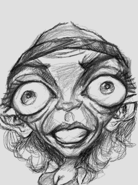
Studies of the subject before taking it to the board just to see what can, cannot, and SHOULD be done with him.  I thought about giving him the angry warrior face, but turned it down simply because his personality ain't like that.  Looking at it, it was for the best as the scene between the three characters wouldn't have worked out as well with an angry face.  As is, those who know him well will know that the depiction used makes a lot of sense.
 
Preliminary Pencils.  The face is was actually sketched out twice on the board as the original drawing just wasn't doing it.  It's very important to listen to your gut on these things at times, if it don't feel right SCRAP IT.  Start over.  MAKE IT RIGHT.  If I had kept it the way it was beforehand I'd have hated it forever and ever.  Sure there's always the feeling of there being room for improvement in everything but anything more than that is not the kind of feeling you want to have at the end of a project.  At least, at the minimum you'd try to avoid that at all times even though there are those situations where it's unavoidable.  Fortunately, this isn't one of them.
Inks.  One thing I'm beginning to realize is that the more you build up the pencils, the worse the inking process seems to get.  There's nothing worse than dealing with a really tight pencil drawing and then being too afraid to ink it for fear of it losing its looks.  Now it's still important to do the pencils up well enough so that you know what the heck you're putting ink and pens to, but at the same time it's good to leave a little bit of room for the inks to play a bit as the picture WILL change when they get on there.  This tends to keep the inking from looking too much like a trace job, and more like a finished original drawing. 


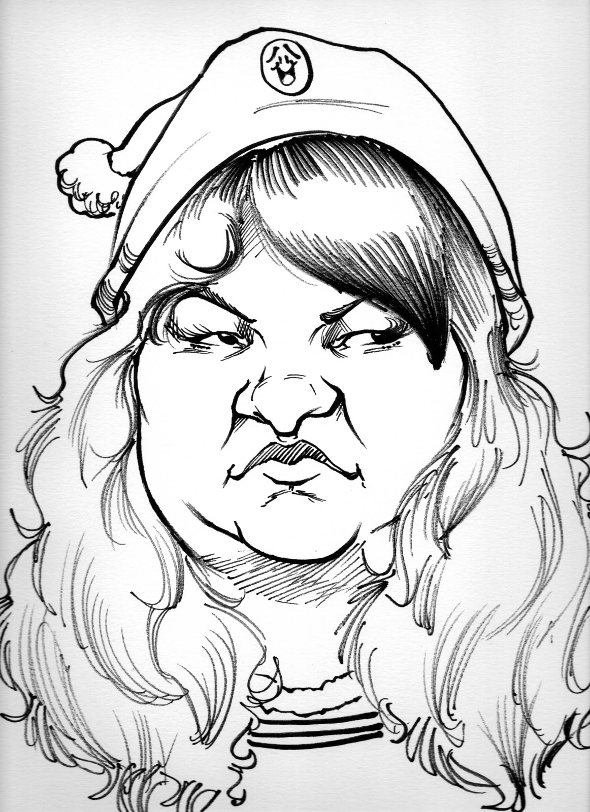
Some close ups of the details.  Quite a bit of .1 and .5 pen work for the hatching.  IMO this can be some of the most fun stuff to do on pieces like this.  It's actually quite relaxing.  One nice thing about hatching with lines like that is that it lends so well to the coloring, especially with making the shadowing that much easier to deal with.

And here is the final color piece.

It's times like this that I remember what it was I liked about pen and ink long time ago.  Especially on illustration board where you don't have to worry about poking through paper if you're too hard on a stroke. 

Anyway, this small deal is based off the latest Zelda title, Skyward Sword.  Granted this was the first Zelda that I didn't get on day one so I had to do a little Youtube research to get an idea as to how to approach it.  What I chose to do was place the entire picture on Skyloft, with the important landmarks in the back, while incorporating some humor with the fairy and Fi.  (bonus points to anyone who knows WHO the fairy is...)  His attention is on the kissy fairy (for good reason, it's nice to have hearts!) while Fi is getting shielded off.  And just like Fi, she goes into mathematical analysis mode while showing mild disgust (I know she's SUPPOSED to be emotionless, but she damn well shows some at the end of the game.  Creative license folks).  And before anyone brings it up, I know she doesn't have arms, but the scene wouldn't work without them.  Again, creative license.

I used the color pencils on the characters and such since they laid down a smoother pigment, while using the color sticks for the background.  Reason why is because the game itself uses a filter for background elements that texturizes it somewhat like a watercolor painting, and while the sticks weren't going to get the exact effect it would still be textured enough for that to make a difference.

Overall, it was a very enjoyable and challenging project to do and I hope my recipient enjoys it as well.

Artwork is produced with Staedtler pigment liner, Faber Castell Pitt Artist Pens and Prismacolor Pencils and Artstix on 16 x 20 illustration board.

The Legend of Zelda: Skyward Sword and all characters and properties © 2011 Nintendo. 


Wednesday, December 7, 2011

Sneak peek at what's to come...


So what the heck is this, and what does Fi from Skyward Sword have to do with this?  More importantly, who's feet is that on the left side of the first one?  To answer question 1, it's a Skyward Sword themed piece and considering how infamous she's become (or hated) she was a no-brainer to put in there.  Now about question 2, those feet cannot be revealed at this moment.  There's a reason for that and I'll explain later.  Let's just say somebody I know is making a special guest appearance.

Wednesday, November 30, 2011

Warmup and Kirby


Just something to get the gears going again.  Anybody that's a fan of video games should know who this is by heart.  I may use this as part of a bigger thing later on, so look for any other sketches relevant to this one.

Tuesday, November 29, 2011

More stuff from the lab...

 Messing around with more quick drawing techniques...

 Taking myself from mild...

 ...to WILD.  Yeah, chances are I'm not going to be selling a sketch looking like that in the park but it's always interesting to see how far you can push something regardless.  Doesn't hurt that it knocks you out of your comfort zone too.
Same goes for this one here.  He was a wild one from a couple years ago that I decided to study again in an effort to improve.  This is why you should photograph your live work folks!

Out and about again...

 Taking a Hooters chick I've drawn before and tried to push the exaggeration a bit farther this time.  Likeness is a bit questionable now, but it did what it was supposed to do, and that's get me away from my comfort zone.
 Again, pushing form farther on a previous live sketch.
 "Is that the woman that was sitting over there a minute ago?"  Yes siree Bob.  Could've brought the jaw down JUST a hair more though.  She had it, but I was too afraid of turning her into a dude in drag at that point.

 With these two, it was an exercise in not over-shading them, to keep them as feminine as possible.

 This was done at Denny's.  She was kinda hungry over there.

 The resident rocker of the karaoke nights.  It's funny how he always has a scowl.


 This one is supposed to be innocent, though I had to be very careful about this one for what should be the obvious reasons...  Yes, it was a lollipop.


 Didn't quite turn out how I would've liked her to but they can't all be winners right?
 Can you tell that I started him off as a rectangular shape? 
 The one that's two below her actually came first.  This one was more of a secondary study I did after the first.
 Mrs. "MALL CLOSED, FOOD COURT CLOSED"  LOL.  She'll let you know when it's time to go!
 This was the original sketch that the second study was based off of.  Likeness is good, though upturned noses depending on the type can still be a pain for me sometimes.  When you're so used to straight and downturned from the park it can sometimes throw you off when you need to do something else.  All it means is that I gotta do more of them, that's all.
 Once again, not all of them are winners.  IMO, I struck out at the plate here.
Amazing how an initial pick shape and two wedges can define an entire picture.  Wasn't actually going for an accurate likeness here as much as I was trying to warm my mind back up to thinking in simple shapes again for the foundations.  For some reason she reminds me of a really jacked up Alice Edun, though that could also be attributed to watching a peek of Put 'Em Up being played over on the Dance Dance Revolution X machine too.

Friday, November 18, 2011

Pastel Portrait!


This one is a small commission for a couple friends of mine who work in the theme park.  Photo was slightly tricky with a few spots but for the most part it was pretty straightforward with the exception of one important element.  They wanted it in PASTEL.  The last time I used pastels was in college my first year of it, so you can imagine how it felt to pick them up again to produce a work of art with them.  Even more so when I consider that the last thing I did with pastels wasn't anything even remotely close to as complex as this nor was it as small scale (it was 20 x 30 IIRC as opposed to 11 x 14). 

The initial pencil sketch in of this was fine, but admittedly the pastel portion of this was a little scary initially.  This isn't like digital work, where the only real fear is a power outage or your system deciding to FORMAT: C:/ since otherwise you have an undo command for anything that might happen.  Here if something goes wrong it could either mean living with it or starting over if it's too big an issue. Granted, one has to get over it and dive on in as results and experience don't come on their own.  You have to make the move.  Now some initial mistakes with the medium were made, and there are things I've definitely do a bit differently on another piece like it (especially in the planning),  but overall I like how it came out.  It's a bit looser than what I'm accustomed to, yet at the same time that's what makes it interesting to me.  It works out kinda like the paintings you see on a wall where it all comes together the farther away you look at it, which is fine as it's going to be in their home on the wall as a show piece as opposed to an online JPEG file that you're looking at on your monitor.  I may touch up a few areas before I deliver it to them, but aside from that I think I'm going to call this one done.

This was done with charcoal pencil and soft pastel on 11 x 17 textured paper cut down to 11 x 14.

Picture updated as of 12/2/2011 to show more accurate color.

Sunday, November 13, 2011

 She actually watched me draw the older guy, who was the first one I did.  We had a really good conversation while I was drawing her.
 Quickie, but successful.
 A bit more involved again like the older man below.  Very fun to draw, even though it was all in one shot.
 The first of the group of 5 that I've drawn.  Issues I have with it aside, if there's anything I'm really beginning to like about these is that I'm getting to the point where the marker sketches are FINALLY starting to look closer to the DSi based, planned out sketches.  There's still work to be done, but I'm damn pleased with the progress so far.
Also a quickie.  Like the contrast in expression between the smiley face on her hat and her facial expression.  It's not necessarily something I get to do often enough in the park so this puts a smile on my face.

Friday, November 11, 2011

New randoms, and a not-so-random...

 My battery was starting to run REALLY low on the DS with him, so I had to zip him out.  Not as finished as I'd like it to be because of that, but at the same time it forced me to work faster and just get the important stuff down.

 From memory.  He had a long face and I also wanted to try some things here too.
 This guy actually saw his.  He seemed to be a bit disgusted by it, but hey I'm not doing these to cater to people.  This is my lab.  Anything goes, good or bad.
And here we leave off with my friend Melissa, aka the not so random one.  Drew her while she was with family and friends.  She was tougher to get than expected.  Not 100% sure if I got her, but at the same time I find it hard to say it's a miss.  Then again, she's slimmed down considerably since we used to work together in the park so I wouldn't be surprised if part of my conflict here is stemming from that. 
Regardless of all that though, I do find it damn cute which is what I was going for so it does succeed there.  As of this posting though, she hasn't seen it yet.