Tuesday, August 19, 2014

A weekend with Sean Gardner and Nick Mitchell doing zombies.

So last weekend, I was given one of what I feel was one of the biggest opportunities in time doing caricatures so far.  A couple weeks back I got a message from Sean asking if I wanted to come down to the VA Beach Tattoo Festival this year and draw Zombie Caricatures with him and Nick.  It was 7:45 in the morning when I first saw the message, but needless to say I went from half sleep to totally up in a matter of seconds.  In the back of my mind, this was something that I always thought would be really cool to experience, but nothing that I didn't think I'd actually get the opportunity to do.  So to get invited to do this was an offer that I couldn't refuse.  I had to work some scheduling magic to pull this off, but needless to say it happened and for three days I traveled down to the VA Beach Convention center to have at it with who I consider some of the best at caricature and art in general.

I will say that I've learned a ton of stuff this weekend, not just about drawing zombies, but I'd say it was a lesson on drawing itself.  I learned a lot from watching, some great critiques, and just drawing different people.  It's real cool to see where I started at the beginning of the weekend to where I ended up.  There's still plenty of room for improvement with all of them, but overall the weekend was a huge success.  It helped me get a better grasp on certain things that stumped me for a while, and it also made me realize the importance of line work.  When you're working on stuff with the kind of detail this has, it's important to really prioritize how you handle your line quality, as it can make the difference between an unreadable drawing, and one that's great to look at.  Watching them use lines in their work was awesome, especially since there's a lot of small nuances to what they do that you're not going to really notice unless you're there watching it happen.

Whenever I get another opportunity to do these, I will definitely make sure to push the boundaries even farther than I did this time around.  In the meanwhile, here's the blood bath from the weekend, all 16 of the unlucky dead.


 No. 1  The first one I drew the whole weekend.  Tried some new ink tricks here, but I can definitely see that I could've pushed some line weights a bit more.  One thing I noticed that they did was go back over their lines if it wasn't enough the first time, and it's something that I definitely should've done more with this.


No. 2.  A little bit better than the first.  Hair got a bit too stiff for my liking though.  And like before, could've used some better lines in spots.

 No.3 and 4. The first one I was really feeling.  Also the first double zombie sketch too.  So far it was all B/W drawings, but I feel like that was a good thing as it really made me work on my lines.

 No. 5  The undersketch had more life than the final drawing did.  I betrayed it's flow a bit too much, and got lost with some crucial things.
 No. 6 and 7.  The first color sketch, and the first one to incorporate blood effects.  It makes a world of difference and is totally worth the extra charge for it.  I like the expression on the guy.  And that side of his face looks really nasty.
 No. 8.  Fairly simple, but pretty solid drawing though I wish I detailed the exposed skull on his chin a bit more than I did.

 No. 9.  My favorite of the day.  Stuck to the undersketch pretty well, didn't shy away from the angle I wanted, and the likeness was pretty damn good.  People watching were really liking this one too.

 No. 10, 11, 12, and 13.  Walked right into this one right off the bat.  Actually got a little scared at the start from the idea of doing 4 on one, but I made it happen.  The beauty of doing it this way is letting your exaggerations and/or ideas fit the people on the page as opposed to four boring circles.  Creates a dynamic look for your work.  Also liked how I didn't have to shy away from a kid's actual facial quirks on this one.  Especially with the mouths and how the muscle makes it look underneath.
 No. 14.  Tried another downward view.  Pretty successful likeness, and a fun pose.
 No. 15 had a request.  He didn't want a double chin.  I can make that happen for you!

 No. 16, the last one of the convention, and the ONLY B/W one of the third day.  He wanted something involving tattoing on his drawing, so I made sure to get it out of his head.  Literally!  Tried some new exaggeration challenges with this one, and it almost totally came out like I originally envisioned it.


Wednesday, December 11, 2013

Matt Smith and William Hartnell Dr. Who revisited

   
The old...
 And the BOLD!

And the two of them side by side on the table as small prints.

 The original park sketch that you see up there actually sold and is the only one that I don't have hanging up on the wall.  Besides that fact though, it's also the main sketch of the entire group that was a definite candidate for a digital followup as I felt it was the weakest of the four Who sketches.

Needless to say, much of the faces on both doctors were altered considerably.  Especially Matt Smith's likeness, but a lot of William Hartnell was reworked as well. Also changed up some background elements, particularly with the lightning bolt, and the TARDIS flying in the distance.  I felt like it told a more epic story that way.

Technique wise, I went back to the older digital acrylic settings similar to the ones I used for the painting of Christie.  I didn't allow for the gradients to be as smooth as that one though, as I needed their their faces to look a bit more chiseled and defined.  I was thinking of making it more detailed, but started feeling like too much would take away from the whimsical feel that I felt like was really showing its head.  1000 wrinkles or no, you can still tell who it is.

That said, I am considering another Who revisiting.  But I think this one will be done with real canvas and paints.  Stay tuned.

Thursday, November 7, 2013

Portrait of Apryl

The final finished piece.  16 x 20 acrylic on canvas.

This was one of those things where I could've easily decided to do this digitally like many of the other ones and been done with it.  The issue with that was that I've been looking at a lot of traditionally done paintings as of late, and while I have zero issue with digital and will continue to explore that option I felt like I needed to "return to nature" for a lack of a better term.  I needed to feel that brush, the strokes on canvas, the experience of physically mixing your colors instead of relying on a color wheel or slider.  More importantly, there was a question I needed to have answered.  Could I survive without the undo command?  The ability to lasso and move something if you don't feel it's correct?  Could I work without the comfort of that safety net?  And could I still get the kind of results that I wanted knowing that certain things that could happen easily with digital wouldn't come as easy on a real canvas?   

Well, it was time to find out.  Even if it didn't work out, I'm not gonna argue one bit about the subject matter.

This was done with acrylic paint on a 16 x 20 canvas.  The reason for acrylic instead of oil is two fold.  Oil would force me to work outside unless I want to die of the fumes from all the chemicals used in it, acrylic dries much quicker, and I've always felt at home with it back in college.  Granted the trade-off here was that blending would be a bit more of a pain since it dries faster though that acrylic glazing liquid from back then offset that factor a bit.  
In the beginning I used just the primary colors and white to create every base color that I wanted to use.  Granted, whether traditional or digital, I think this phase can be one of the scariest times of the whole project.  You can see what it is that you want it to look like in your mind, but you often have to remember that things constantly change.  This one was no exception.  
A second pass, a good deal later on down the road.  Still working out a lot of stuff, but the figure is getting more refined at this point and the beginnings of water is starting to take shape.  Background is still very basic though.  When I worked on this I moved around the figure a lot.  Don't stay in one place for too long, or you'll find yourself missing the big picture.
Solidifying the color temperatures of the environment at this point, adding details in areas, and making corrections all around as I went.   

I went for a full figured portrait on this one, as I really wanted to capture as much of the real person in the painting as I possibly could.  A caricatured figure could've been interesting though and that'll be something I'll consider for a future project.  That said, while the approach to the subject was pretty strict I did keep parts of it open to interpretation.  After all, if someone wanted it to be 100% exact you can just get a photograph to do that.  It's like my instructor George Pratt mentioned in my illustration class long ago, "Let a painting be a painting!"  Couldn't think of a more appropriate approach.

Credit goes to Paul A Presenza's Photos for the reference shots used, and to Apryl Crowell for being an awesome model. 

Tuesday, September 24, 2013

Zombie Caricatures!

 The first one I did as a test for things.  Getting a basic feel for things.
 Another one.  Still working on it.
 I like the look of it, but still a bit too complicated for my liking.  That and it wasn't until the next one where I figured out why the blood was bugging me.
 Redraw of a sketch from early last year.  This time using a red marker for the blood.  It's quicker and looks a LOT better.
 Starting to get there a bit more now.  He needed to look a bit deader, and I also needed to watch my coloring as well.  It's really easy for these to get too muddied up.
 Redraw of the first concept sketch.  Much more like it this time.  Definitely getting nastier.
 The first zombie sketch I've done of myself in a while.  If I didn't know any better, that looks like it should really hurt.
 The second real person done this way.  Starting to incorporate brains now.
 The second actual sale.  The first one was done beforehand and I couldn't get around to taking a picture of it.  Found some ways to simplify it for the sake of time, but it still looks pretty decent.  They liked it.
 He wanted football incorporated into it somewhere.  I incorporated it into his head.
 This one was the start of a bit of a different approach to it.  I felt like this was when they started cooking.
 Tried some new things with this one too.  That split head thing is the pits...
This one was done at home for someone who saw my instagram posts and wanted one too.  I used it as an excuse to try out things, and because of that it took two hours just about.
Still gruesome, but still recognizable.  I'm seriously surprised that I got away with giving her the chin that I did.
 This one kinda got rushed to finish, so cuts (no pun intended) were made.  Still worthwhile though.
 Enter, THE MOUSE.  His face turned out really interesting.
 The dude's ok, but the chick...  She turned out almost entirely how I envisioned it.


This mom and daughter duo was very interesting.  Was shooting for personalities more than the gross factor here, though I do like how what I planned out in my head mostly happened how it was supposed to.

So if it's anything I've come to realize about these is that often times you can still get good results without even doing a lot to them.  I've also found that due to the nature of these, there's things I seem to be able to get away with in terms of the head that I normally wouldn't be able to do on a regular park sketch which I find absolutely fantastic.  What I've found is that just doing two to three different things tops will usually sell the idea just enough.  Too much, and you'll run the risk of cluttering up the sketch like I did with some of the ones in the beginning.  Clutter puts a hurting on likenesses, as you still need a certain amount of facial clarity in order to be able to see the person inside the sketch that's being maimed.

Feel free to check back to this album, as more of them along with insights will be added as Howl O' Scream progresses.


10-1-2013 update.  Some new ones.
Just looking at how I handled the blood on the blade makes me cringe...
 Another couple.  Tried a couple new approaches to these ones.  I think the gal turned out really interesting.
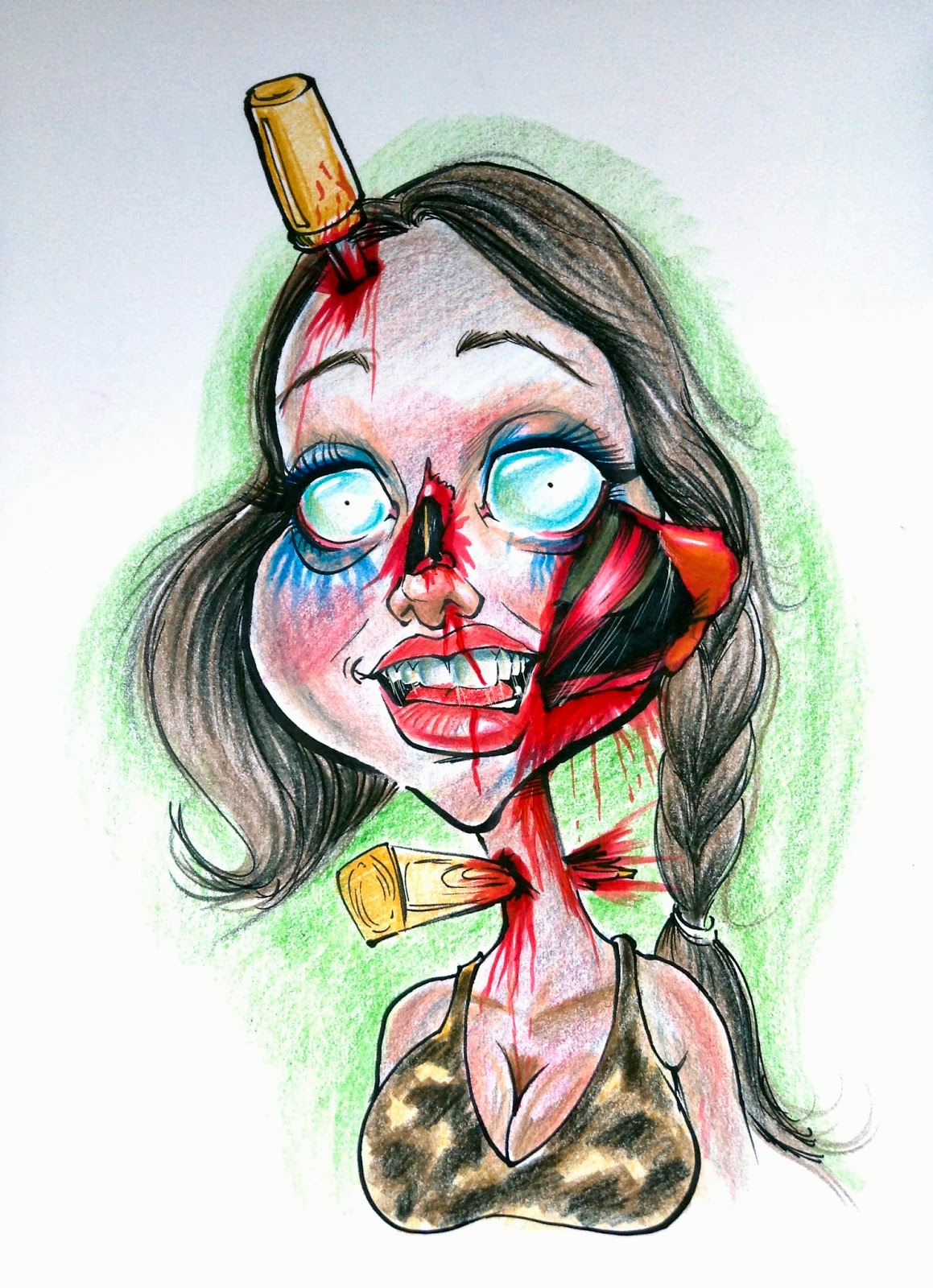
And this kid wanted the undead special as well.  Yeah, he's definitely the man, with that stake in his head!  Mom LOVED it!
One note for this week:  I'm finding that drawing sticky and stretchy stuff looks cool when done right.

10-22 Update.  

Zombie wedding proposal.  The only full body one I've done so far.


 With these two, they came to me specifically to get theirs drawn.  The daughter especially wanted to be bloodied up really good.  Come find out her and dad are also artists themselves, which is always an awesome thing.
 Hey, you're not supposed to... OMG!!!!
 Looks like she had a rough day at the park.  The infected pets at Pet Shenanigans got to her.
 Is that blood from her mouth from an injury, or from a previous brain buffet?
 These two got stuck on Apollo's chariot.  Unfortunately, the ride operators were infected too.
 Some zombie wants her brain the "posh" way, we're actually gonna cut it up first like real people!  Her friend is amused.
 Before going to Busch this day, he was told to make sure his wife didn't get "ahead" of herself...
 The infected eagles in the wild reserve decided that the park food was no longer going to cut it.
 These two walked into DEADLINE one way, and came out minus their souls.  The dead of Pompeii LIVES!

Save for the first one, this new batch has one major difference.  The use of foamies.  It actually makes the coloring and shading quicker and easier, and it doesn't bunch up like crazy like it normally would either.  Back in my second year in the park I used one for a little bit but didn't like the results of it at the time.  While I probably wouldn't use it for the regular sketches in the park just because of the nature of them, it will be used for every zombie at this point, and quite possibly every commission I do.  It gives everything a finished look that doesn't require as much effort and allows me to have more coloring options for shading too since colors like indigo blue won't initially go on as strong anymore.  There is another one that I'm working on for someone, but I won't post it until it's totally done.  I will say that the foamie went a long way toward getting the results that I got from it.

10/23

Absolutely, positively cannot forget this one.  If I have words to describe it, she's beautifully ugly!

10/28
Oh, and one more for the road.  This one's all about the ponies.  The contrast is quite striking if you ask me.